A Freshman Project Turned Creative Exploration
UX/UI Design
Course Project
Fall 2025
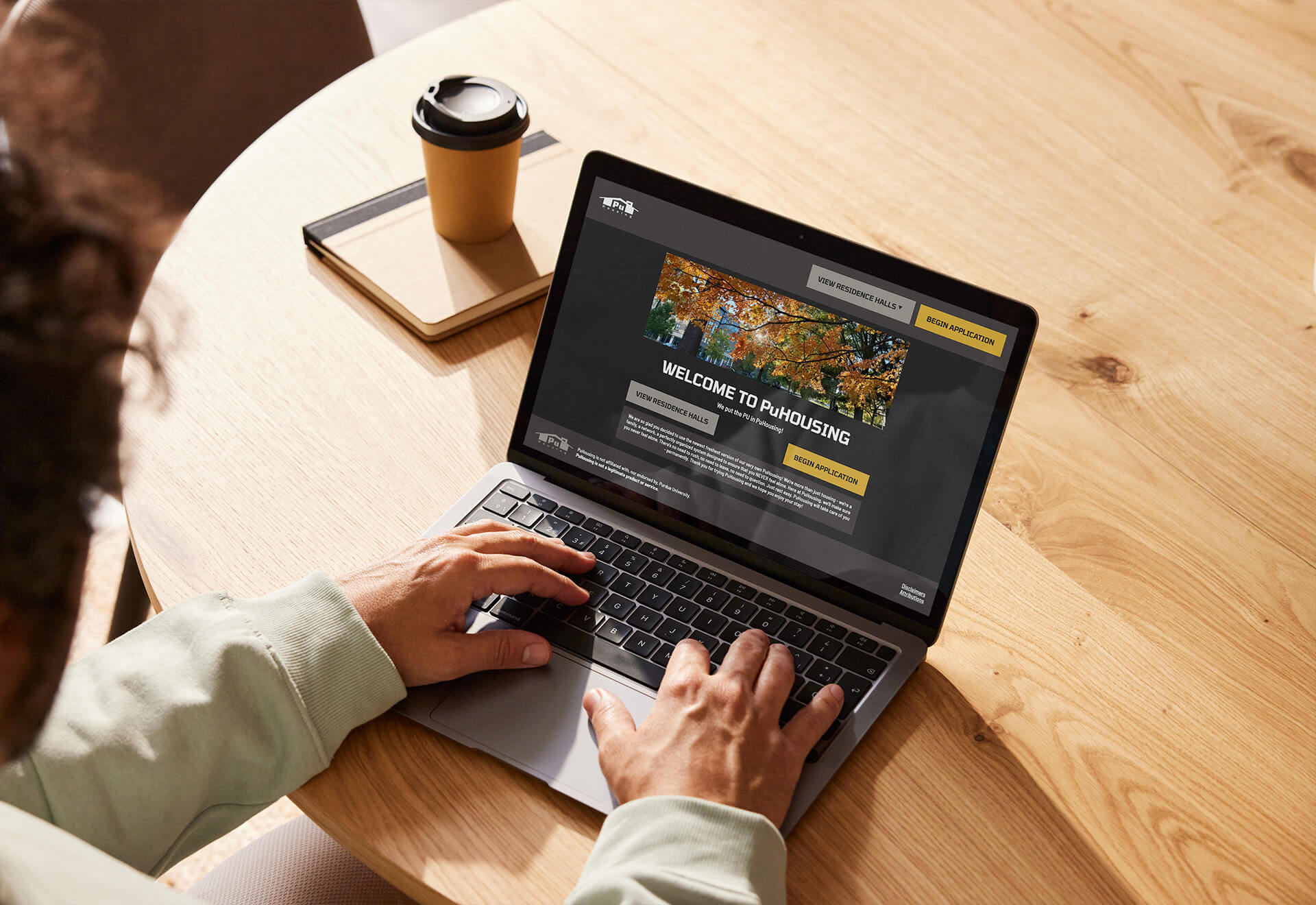
Project overview
The Purdue Housing system has always felt like an interesting experience.
Instead of recreating the real housing portal, we decided to make a parody - a pretend, comical version of Purdue’s Housing System: PuHousing. We gave dorms funky names, “fair” housing lotteries, and leaned into the humor of how stressful choosing a place to live when you’re freshly eighteen and new to campus.
The project became our way to process our freshman housing experience. It wasn’t just about building a website; it was about capturing the feeling of navigating something confusing and stressful into something people could laugh at. That direction shaped our design decisions, from the tone of our content to the interactions that poked at the actual process. We transformed familiar parts of the Purdue housing experience into something unexpected and entertaining.
01 - Background
Working on a team of six students who barely knew each other wasn't the first challenge; it was figuring out how to work together. Most of us were freshmen, new to Purdue, and all trying to make sense of our first large college project. The early meetings were chaotic, with scattered ideas and different expectations.
Once we had clarity, our conversations helped me sketch early concepts, mock up flows, and build the first version of our interface. By the end of the project, PuHousing felt like a true team effort, but I’m proud of the parts I shaped most: the initial direction, the structure of the experience, and the visual feel of the product. Me and another team member alos worked on the majority of the front-end development, which taught me how design changes work once it became real code, and how important it is to think about viability early on.
My main contributions included:
- Helping the team define the problem: asking questions and turning ideas into a clear direction
- Shaping the early concept: sketching, exploring, and building early versions
- Designing the experience: creating flows, layouts, and visuals
- Building front-end: implementing components and learning how design decisions transition into code
Tools:
- Figma
- Visual Studio Code
- HTML/CSS
- Javascript
- PHP
02 - Content / Ideation
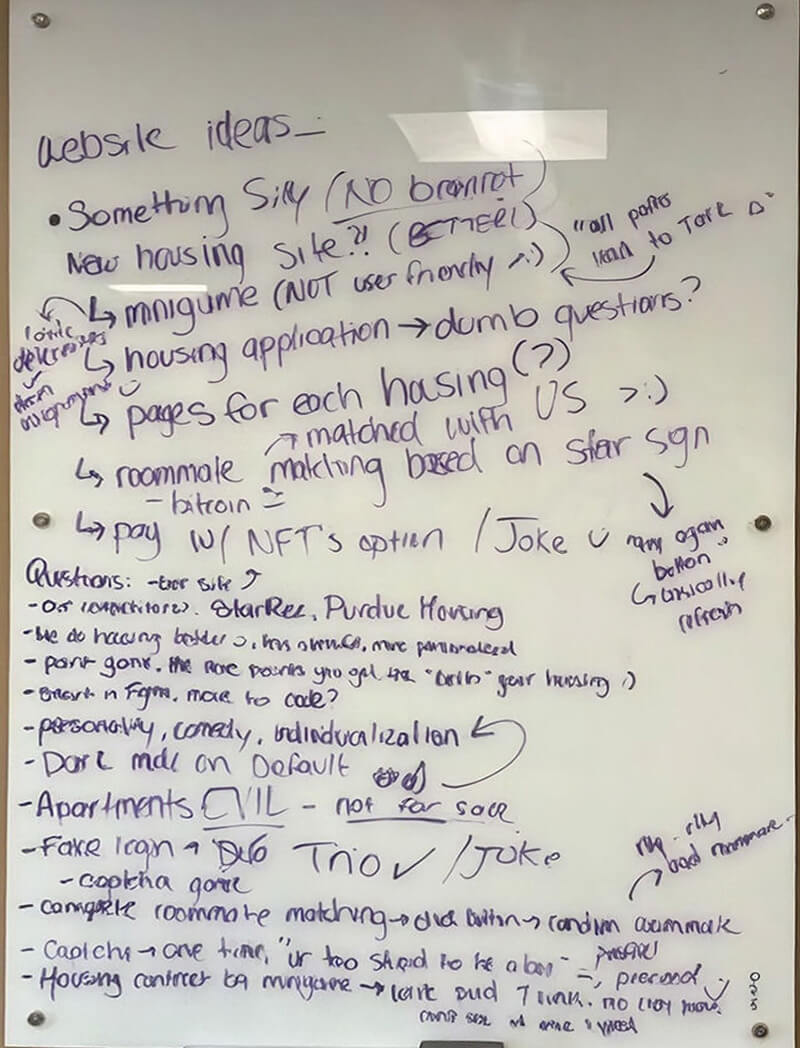
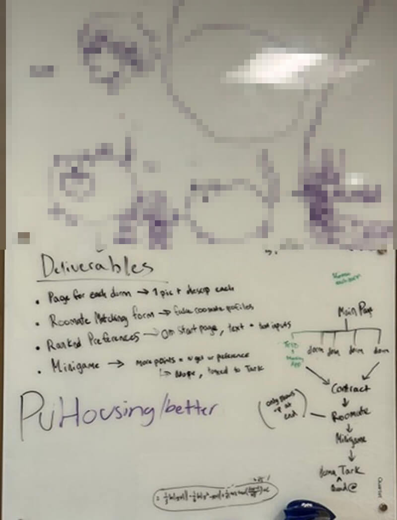
Once we agreed that PuHousing would be a parody of the real Purdue housing portal, the fun part began: figuring out what this ridiculous project actually looked like. We started by examining our own experiences through what the real housing process feels like as freshmen: confusing pages, numerous steps, and the fear of getting the “wrong” dorm. Using that shared experience, we sketched ideas and a simple flow of what a student normally does through the portal, just so we had a standard baseline to twist and exaggerate
From there, we let ourselves get crazy. Every dorm got a remixed name, every residency had a sarcastic description, and every image was a different ironic reference. We added sneaky contracts, weird surveys, and extremely questionable roommates, and a game-based lottery system where you could “win” better housing.
One of the most interesting parts of the project was deciding where to intentionally make the experience frustrating, or implementing dark UX. We wanted the humor to come from moments where the interface acted a little too realistically. So we designed interactions that were purposely annoying but still functioned for users. It became a creative challenge: how do you make something terrible and confusing on purpose without making it unusable? Those choices ended up being some of the most memorable and enjoyable moments of the project for me, laughing at the evil ideas we came up with.
By the time mid-term presentations came around, we had the opportunity to present to fellow students, and we received overwhelmingly positive responses from students and the professor telling us he was excited to see what was next. Seeing them genuinely engage and enjoy our concept showed us that we had created something fun and meaningful to all of us.
03 - Design
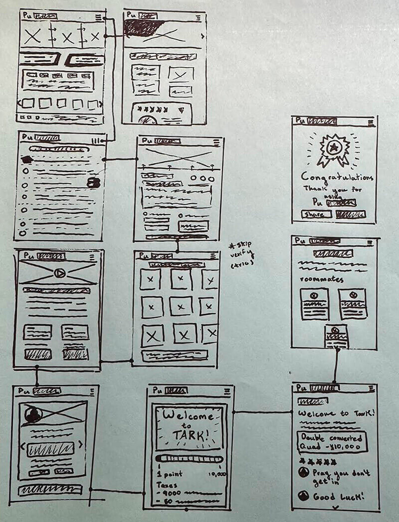
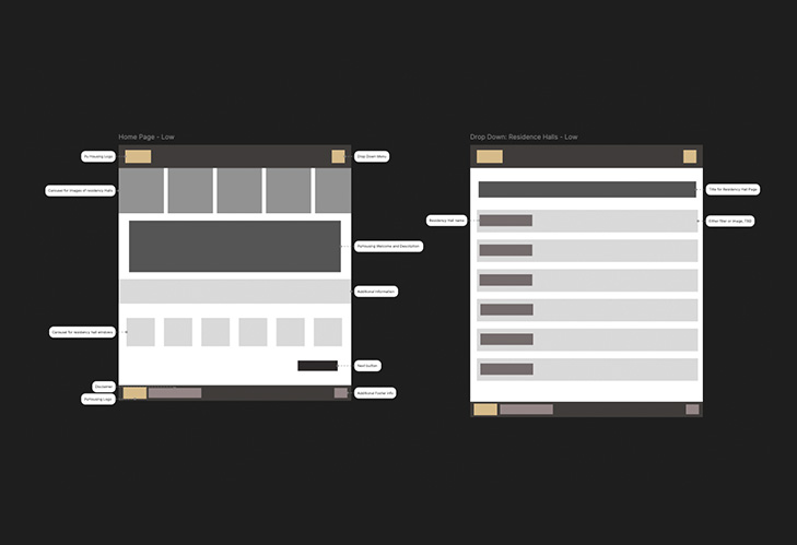
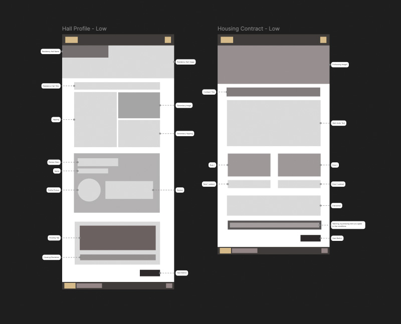
Once our ideas started getting wild, we realized we needed a way to see everything outside of our imagination. So I began working on low-fidelity sketches. Nothing fancy, just quick drawings and messy digital mockups that helped us understand how a student might flow through our parody housing portal. These early sketches were where we learned how to make sense of our idea; what didn’t work; and what was just funny in theory but confusing in practice. This was the first time I saw how much clarity you can get simply from putting something on a single page.
Seeing the flow laid out helped us catch problems early, with some steps feeling too long, some jokes didn’t land the right way, and some interactions were funny but didn’t help the story. The low-fi stages became our playground for testing ideas without getting too attached to them. We could change things in seconds, erase entire sections, or rebuild the flow from scratch without feeling like we had to start over.
Once we had a clearer sense of what belonged in PuHousing, we moved into mid-fidelity prototyping. This was the moment everything started to feel real. We focused on structure, layout, content, and how each part connected to the next. Because our project had so many unexpected twists, this stage was important, forcing us to filter the chaos into something that actually worked as a website.
Mid-fi was where we had to make the tough decisions: which jokes stay? Which ones sidetracked? How do we keep the experience funny without making it offensive or impossible to use? Seeing the scenes in a more defined format helped us shape the final personality of PuHousing and gave us a solid foundation before fully jumping into the visuals.
04 - Style Guide
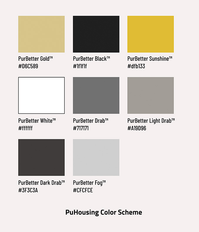
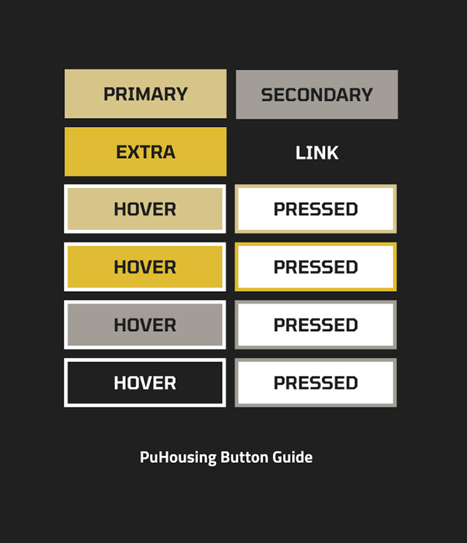
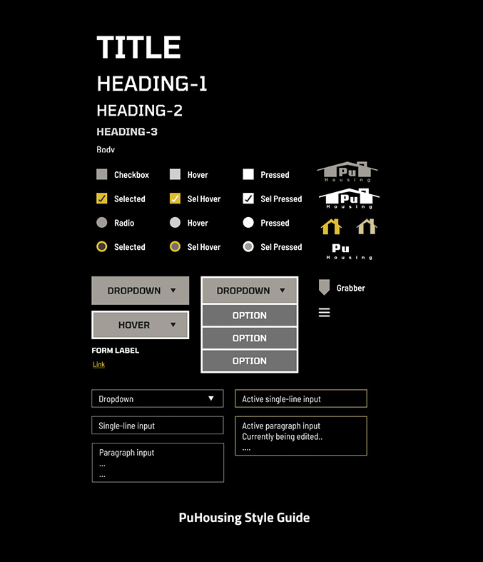
We didn’t want PuHousing to feel like a cheap bandwagon of Purdue’s actual housing site, so we created a style guide to give our site its own personality and swagger. As a team, we agreed that the project should still feel “Purdue-adjacent” but not identical, to ensure the irony was still there. We experimented with colors, type, and layout until it felt like a sleeker, more playful, and cleaner version of the housing experience we knew.
The style guide helped us stay consistent as the project grew. Any time we added a new page or feature, we used it as a checkpoint, helping the website avoid drifting back to the original portal's design and keeping our distinct look.
05 - Trio
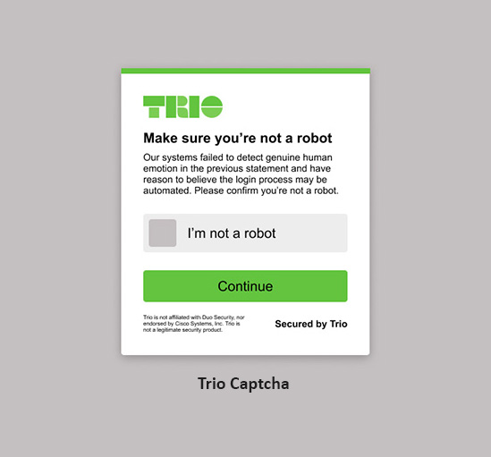
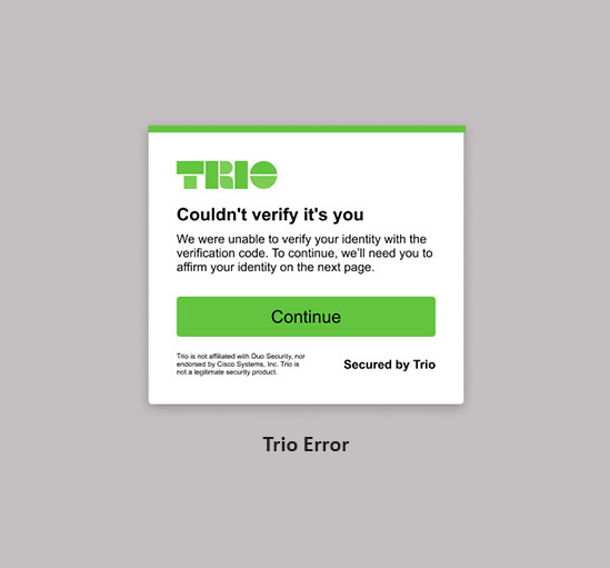
When we were building PuHousing, there was one part we couldn’t ignore: everyone’s favorite part and the true essence of the Purdue Experience - our beloved two-factor authentication. Every Purdue student- no, every college student- knows that annoying moment when you're trying to log in and your phone is across the room or nowhere to be found. It’s annoying, it’s iconic, and it's every college.
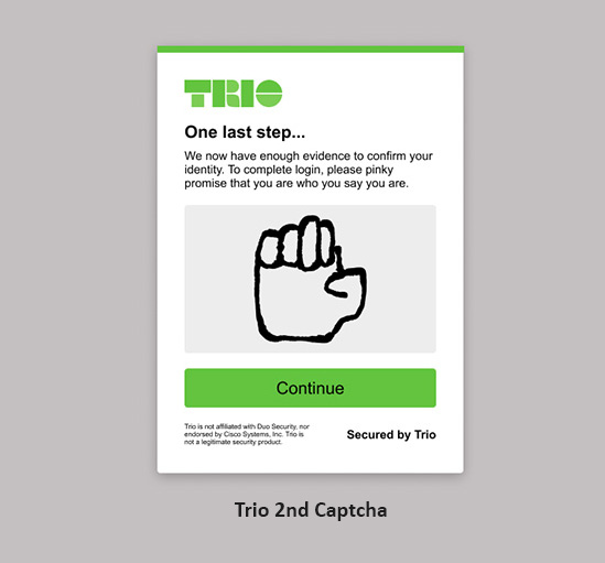
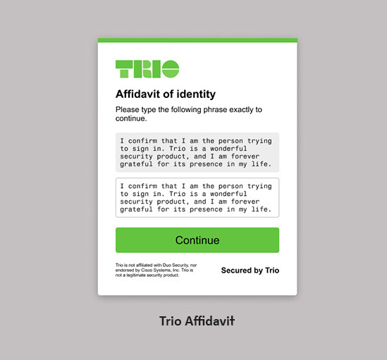
Because Duo was such a big part of our daily routine, we knew our parody wouldn’t feel complete without our very own two-factor authentication. So we created Trio. Our exaggerated, overly dramatic version of Purdue’s authentication system. Designing Trio was one of our favorite inside jokes because it was poking fun at something every student has struggled with and lived through.
Adding Trio gave PuHousing a touch of realism layered with humor. It’s a small detail, but it helped the whole parody feel grounded in actual campus life while still being completely unhinged - exactly what we wanted.
And our team was devastated to see Duo go from Purdue.
06 - PuHousing Game
At a certain point in the project, our team decided we wanted to add something different that helped complement other members who were more skilled in different forms of coding. Something that showed off our creativity beyond the website itself. That’s how we came up with the idea of adding a lottery system based on a game.
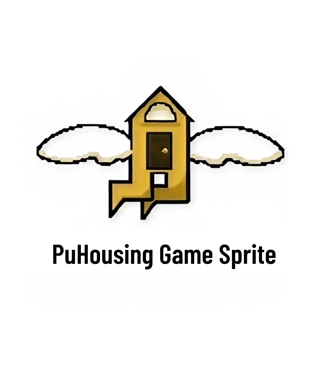
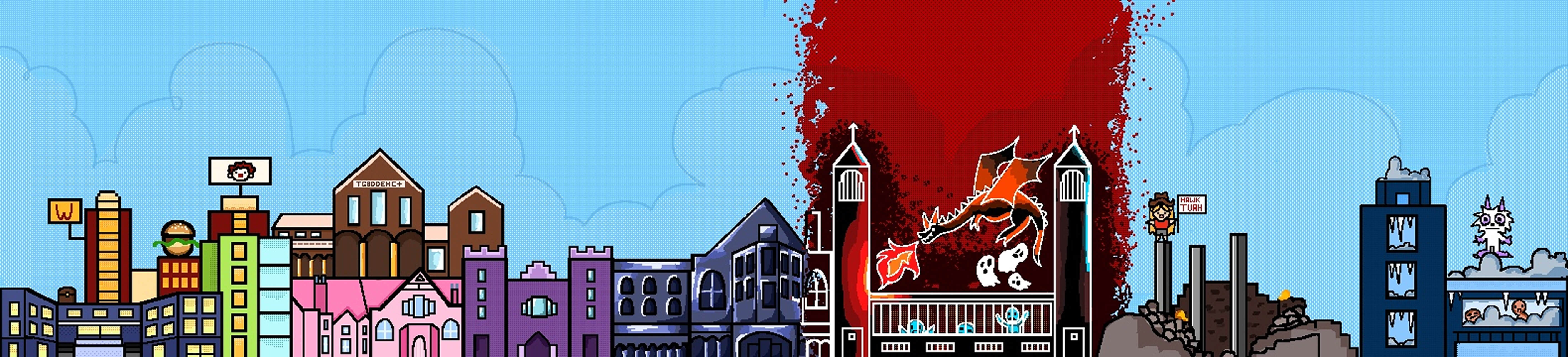
We ended up building a PuHousing version of Flappy Bird, complete with custom images, backgrounds, and sprites. We chose Flappy Bird because it was inherently simple to understand and allowed for instant feedback. However, it was basically impossible. The physics engine made the game so difficult that no one could win, which fit perfectly with our parody theme. The overall high score of the entire game was a whopping 6 pipes. If you played, you were almost guaranteed to end up with the worst housing option - exactly what we wanted.
07 - In Conclusion
Every designer has a project where it all began. For me, that was PuHousing. Looking back, as a freshman, I didn’t fully understand what “UX” truly meant just yet. I just knew I liked solving problems and making things that felt fun and enjoyable. PuHousing was one of my first opportunities to really experience that journey, from starting from nothing to creating a product that people loved.
Looking back, there’s a lot I would do differently now. I would spend more time talking to real users, validating our ideas, and exploring more alternatives before committing to a direction. At the time, we were mostly designing based on instinct, humor, and whatever felt right in the moment, and that’s what made the project my favorite.
PuHousing isn't perfect. However, those imperfections are what make PuHousing meaningful to me. It illustrates where I started, the lessons learned through experimenting and mistakes, and how much my approach has evolved since those early days with one sketch, one prototype, and one evil idea at a time.
Final Deliverables
A humorous reimagining of the Purdue housing experience, transforming the stress of freshman housing into a playful parody filled with dark UX, absurd interactions, and unforgettable dorm choices.