Making AI's Environmental Impact Visible
UX Research & Data Visualization
JJohns Hopkins University Applied Physics Laboratory (APL)
Spring 2026
Project overview
The Hidden Cost of AI began with a question that seemed simple at first: people actually understand the environmental impact of AI?
Most of us use AI every day without thinking twice about what happens behind the screen. We ask questions, generate images, summarize documents, and move on with our day. What we rarely see are the massive data centers powering those interactions and the resources required to keep them running.
As part of the Purdue UX Experience Studio, our team partnered with Johns Hopkins Applied Physics Laboratory (APL) to investigate how AI infrastructure affects communities and the environment.
What started as a research project quickly became something bigger: helping people understand the hidden costs behind the tools they use every day.
01 - Research Background
The deeper we looked into AI infrastructure, the more we realized that most conversations about technology focus on what AI can do, not what it takes to power it.
Data centers consume significant amounts of:
- Electricity
- Water
- Raw materials
- Local infrastructure resources
Yet these impacts often remain invisible to everyday users.
Working alongside our sponsor at Johns Hopkins APL, we met weekly to review findings, challenge assumptions, and refine our direction. Those conversations helped us move beyond surface-level statistics and focus on the human impact behind the numbers.
Our team eventually split into two groups:
Team A: Website & Visualization
Focused on:
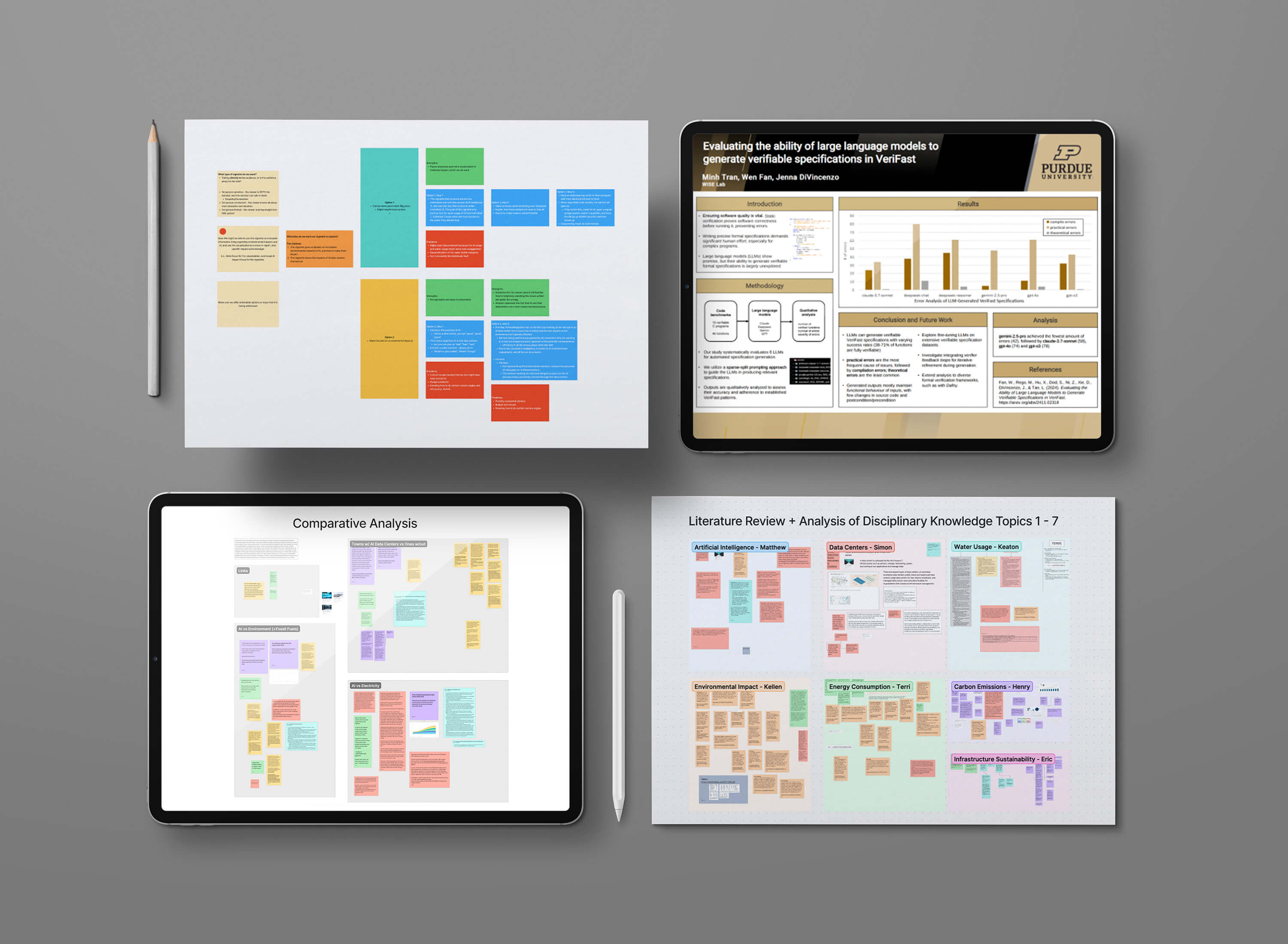
- Research synthesis
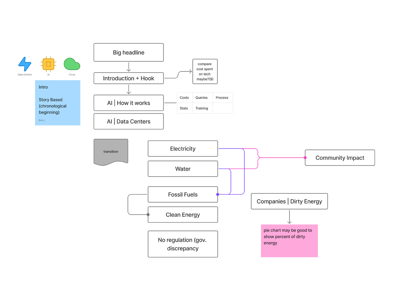
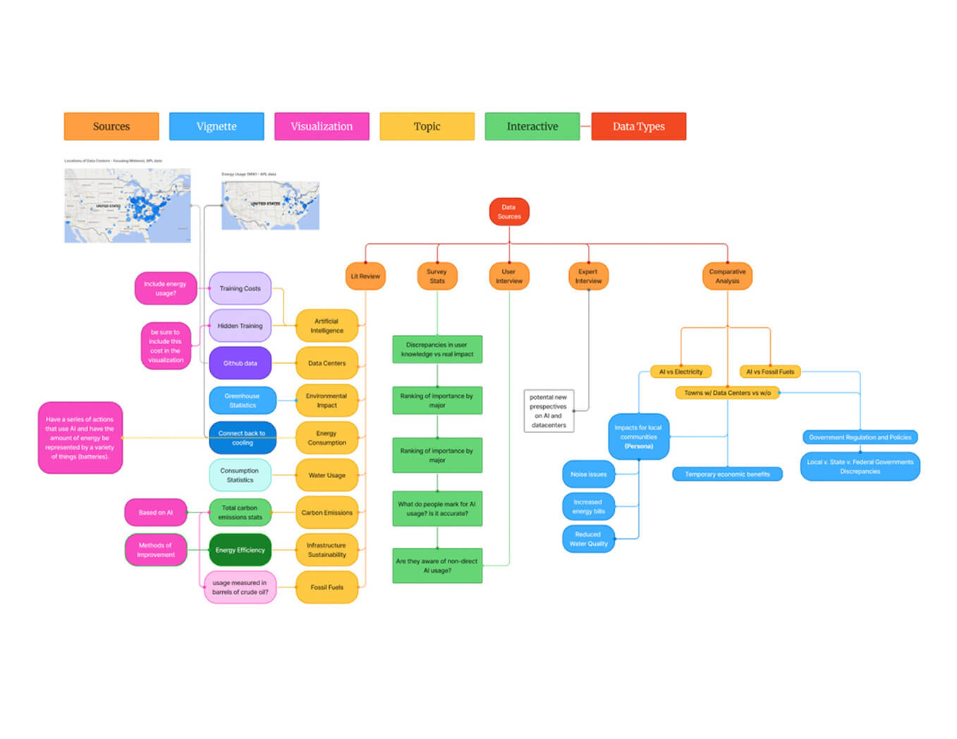
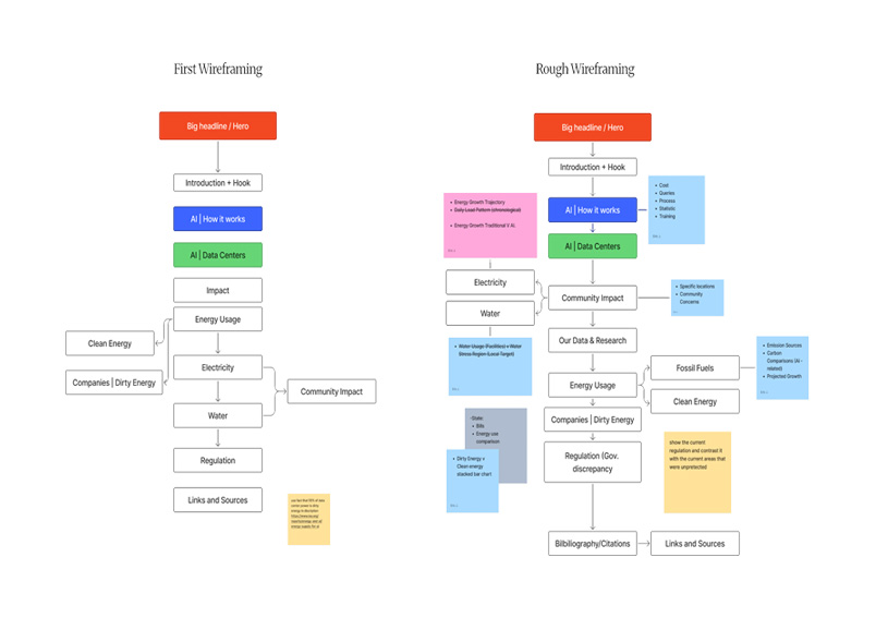
- Information architecture
- Interactive website design
- Carbon and environmental visualizations
Team B: Vignette
Focused on:
- Narrative storytelling
- Emotional engagement
- Human-centered perspectives on AI infrastructure
My Role
My work sat between research and design. I contributed to:
- Literature reviews
- User interviews
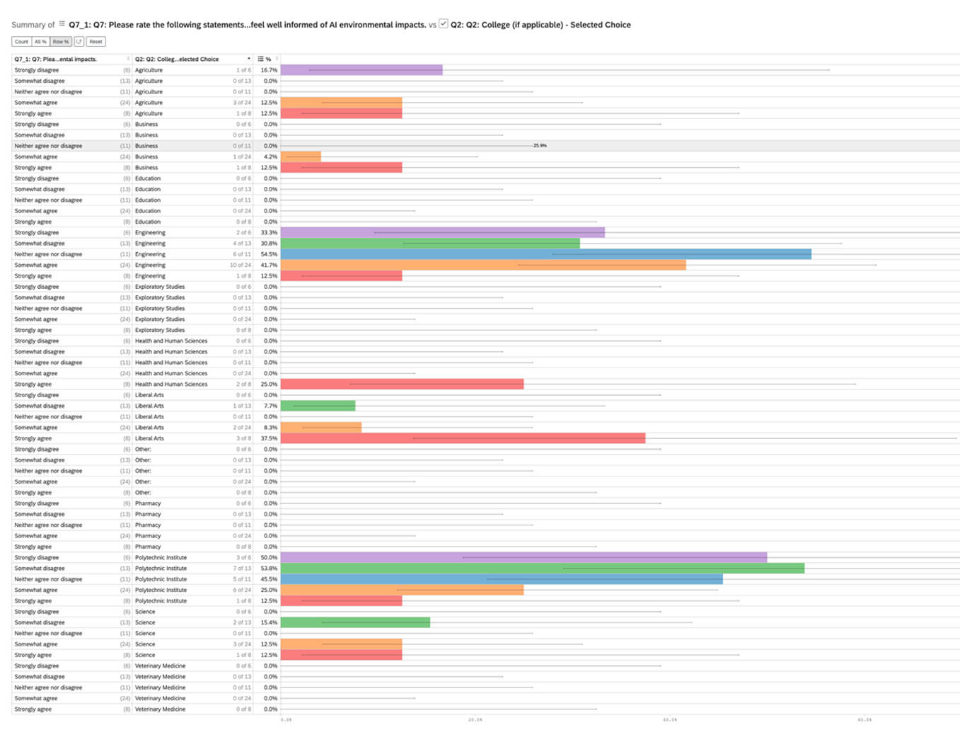
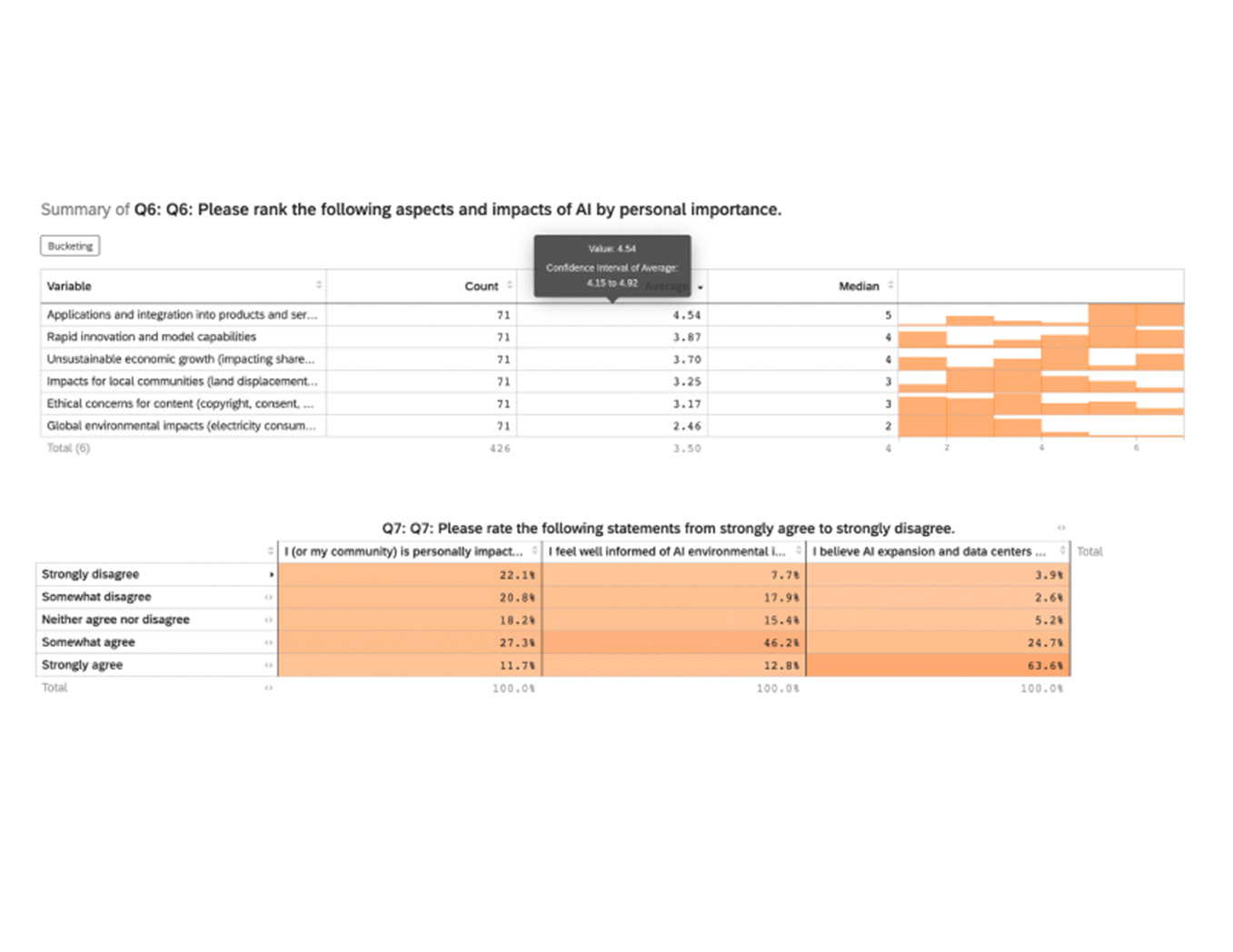
- Survey analysis
- Data synthesis
- Visualization design
- Website content and structure
What I enjoyed most was translating complexity into clarity. I found myself constantly asking:
"If someone knew nothing about this topic, how could this make sense?"
That question influenced nearly every decision I made, from organizing information on the website to simplifying visualizations that initially felt too technical or overwhelming.
02 - Research Methodology
Before designing anything,
We needed to understand two things:
- What are the environmental impacts of AI infrastructure?
- How much do people already know about those impacts?
To answer those questions, we used a combination of research methods:
Literature Review
- Environmental reports
- Academic papers
- Industry publications
- Sustainability disclosures
Expert Interviews
- Weekly discussions with researchers and sponsors from Johns Hopkins APL
- Validation of technical findings
- Clarification of data center operations and resource usage
- Deeper understanding of the political landscape of the current AI environment
User Interviews
- Conversations with students and faculty
- Understanding awareness, assumptions, and misconceptions
- Identifying knowledge gaps
Survey Research
- Campus-wide survey distribution
- Measuring broader public perception
- Comparing awareness versus actual understanding
Research Questions
- How much do people understand about the environmental impact of AI infrastructure?
- How does that understanding compare with more familiar topics such as fossil fuels and renewable energy?
- How can these impacts be communicated in a way that feels relevant, understandable, and actionable?
03 - Key Findings
As interviews and survey responses accumulated, several patterns emerged again and again.
People knew AI had an impact, but not the scale
Most participants recognized that AI consumes resources.
What surprised us was how few understood the magnitude of the infrastructure supporting those systems.
- Energy consumption was consistently underestimated
- Water usage was largely unknown
- Data center operations felt disconnected from everyday AI usage
The challenge wasn't awareness. It was context.
People had heard the conversation before, but they had never been given a clear picture of what "environmental impact" actually looked like.
Individual usage felt too small to matter
Many participants viewed their own AI usage as insignificant.
However, once conversations shifted toward millions of people making similar requests every day, perceptions changed quickly.
I remember hearing variations of the same response over and over:
"I'm only one person."
It wasn't until we discussed millions of users making similar requests every day that people began connecting individual behavior to collective impact.
That shift in perspective became one of the most memorable moments throughout our interviews.
Awareness didn't lead to action
Even among participants who expressed concern, few knew what actions they could take or what sustainable alternatives existed.
This revealed a clear gap between:
- Awareness
- Understanding
- Behavioral change
Simply knowing about the issue wasn't enough.
Visuals changed how people understood the issue
When participants viewed visual comparisons instead of reading statistics alone, their understanding improved dramatically.
The research repeatedly showed that visualization helped make abstract environmental impacts feel tangible and easier to understand.
04 - Research into design
One challenge appeared throughout the project: finding reliable data.
Many organizations publish sustainability reports, but AI-specific resource consumption data is often aggregated with broader operational metrics. This made it difficult to isolate and communicate AI's true environmental footprint.
As our research evolved, we realized a traditional report wouldn't be enough.
- People didn't need more information.
- They needed a better way to understand it.
That insight became the foundation for our website experience.
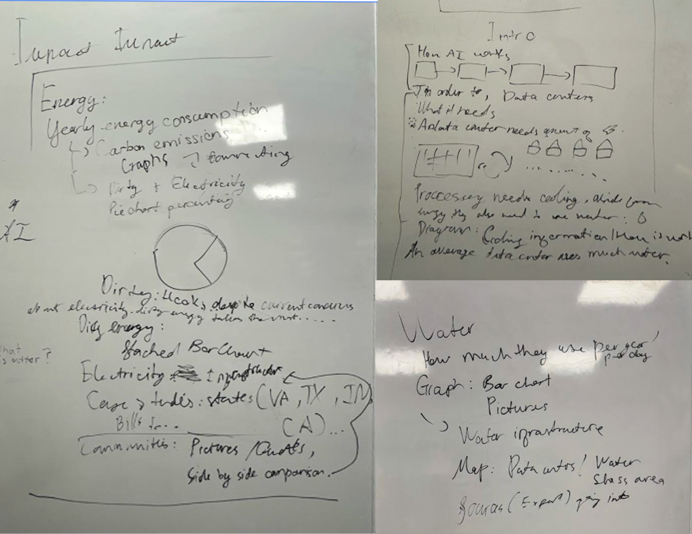
Turning research into a visualization
We explored multiple ways to communicate scale:
- Environmental comparisons
- Carbon footprint visualizations
- Geographic mapping
- Interactive storytelling
One of the most impactful explorations involved overlaying water-stressed regions in the Eastern United States with data center locations.
Seeing those layers together transformed an abstract environmental issue into something much more concrete and immediate.
My Contributions
- Synthesized research findings
- Helped shape site structure and content hierarchy
- Created and refined visualizations
- Simplified technical information into user-friendly content
- Contributed to the carbon visualization experience
The work I enjoyed most wasn't creating the visuals themselves. It was watching a jumbled concept slowly become understandable.
Some of the most rewarding moments happened after multiple rounds of revisions, when a visualization finally felt simple enough to communicate a complicated idea without oversimplifying it.
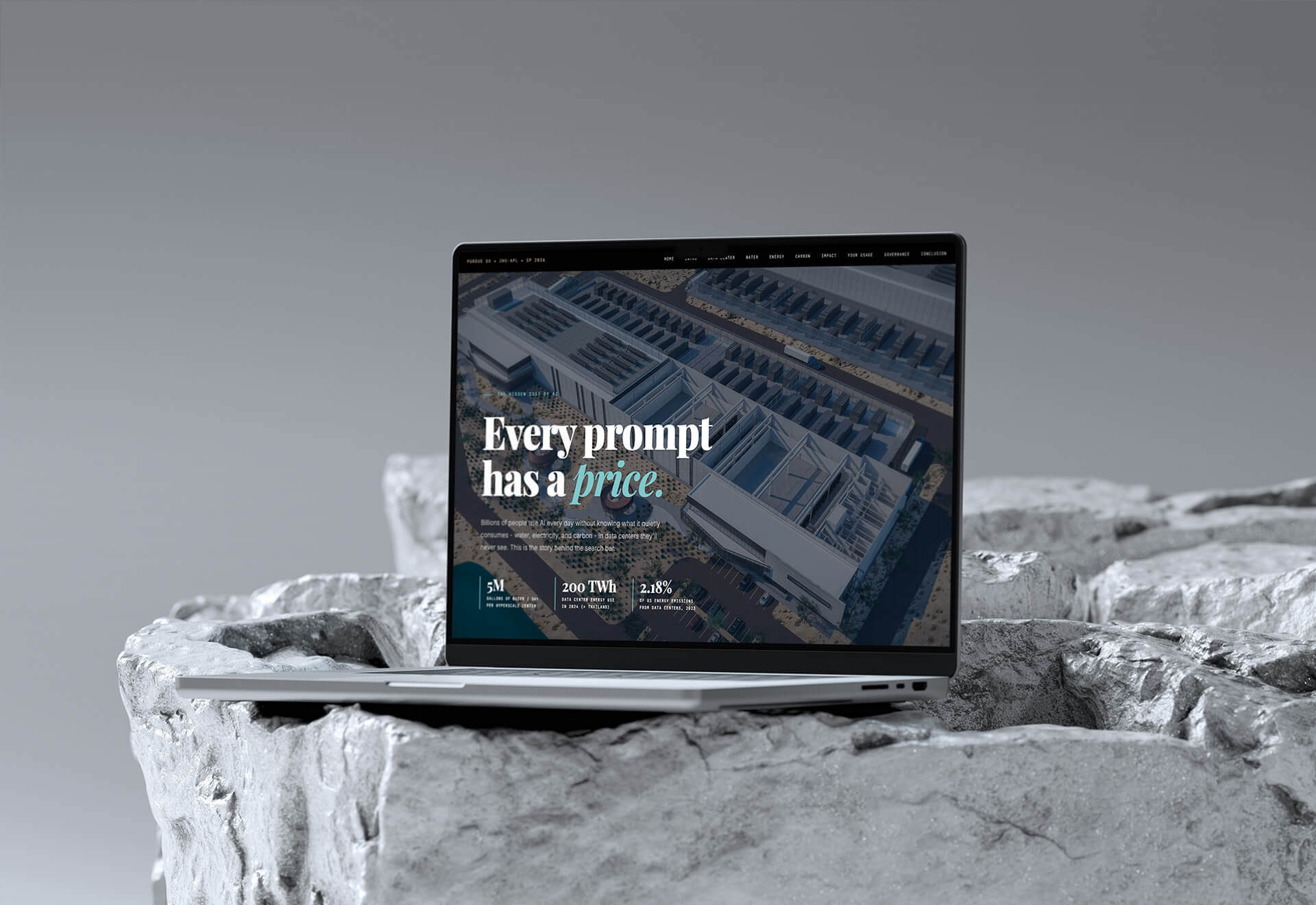
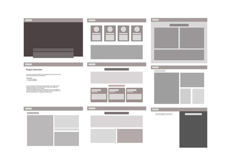
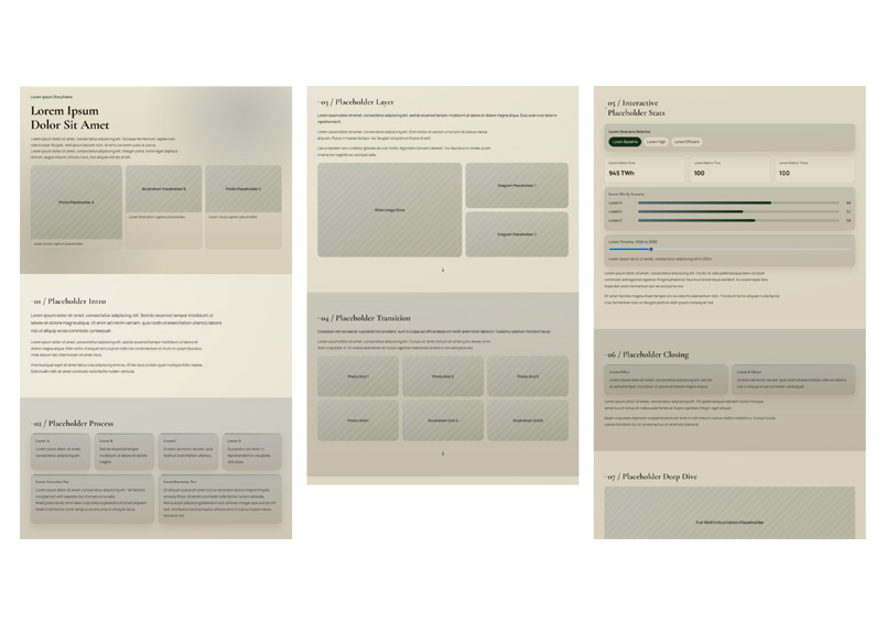
Every prompt has a price - Interactive website translating our research findings into an accessible visual experience.
05 - Vignette
While our team focused on creating an interactive research experience, another group explored a different challenge:
How do you help people feel the impact, not just understand it?
Throughout the project, we learned that data was effective at explaining the problem, but not always effective at creating an emotional connection. That's where the vignette became important.
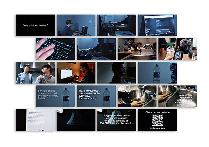
Team B developed a short narrative video that focused on people rather than statistics. Instead of emphasizing infrastructure, emissions, or consumption numbers, it highlighted the communities and individuals affected by the growing demands of AI infrastructure.
Instead of focusing on statistics and comparisons, the vignette focused on people, communities, and the human consequences connected to growing AI infrastructure.
The website and vignette were designed to work together:
- The website provided context, evidence, and exploration.
- The vignette provided empathy, emotion, and human connection.
Together, they created a more complete understanding of the issue by combining research findings with storytelling.
My Contribution
Although my primary focus was on the research and website experience, I also participated in the production of the vignette as one of the featured actors appearing throughout multiple scenes.
Being involved in both deliverables gave me a unique perspective on how information can be communicated in different ways. While the website focused on helping users understand the data, the vignette focused on helping viewers connect with the people behind the story.
Participating in the filming process reinforced an important lesson I learned throughout the project: facts can explain an issue, but stories often make people remember it.
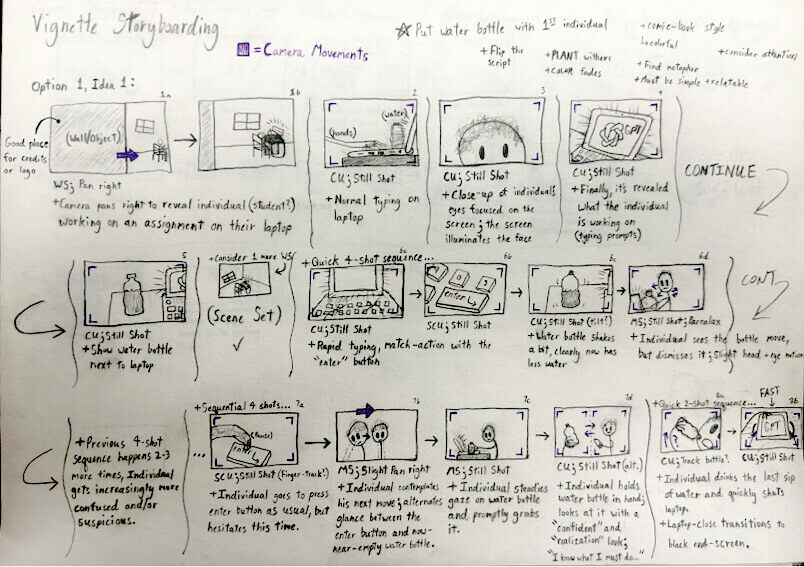
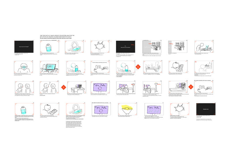
The Hidden Cost of AI: Vignette - An awareness-focused short film that brings the hidden environmental costs of everyday AI use into focus.
06 - Implications & Opportunities
One of the biggest lessons from this project was that the challenge isn't a lack of concern.
It's a lack of visibility.
Before this semester, I would've considered myself a typical AI user. I benefited from the technology every day, but rarely thought about the systems supporting it.
Many of the people we interviewed felt the same way. That realization made me rethink the role design can play in conversations like this.
Design isn't always about making something easier to use. Sometimes it's about helping people understand something they never knew they should be paying attention to.
Looking forward, I see opportunities to:
- Increase transparency around AI resource consumption
- Improve public-facing environmental reporting
- Create more accessible data visualizations
- Support communities affected by expanding infrastructure
- Use storytelling to make complex systems easier to understand
07 - In Conclusion
By the end of the semester, this project felt less like a study about AI and more like a lesson in perspective.
We started by asking how much energy AI uses. What we discovered was a much bigger gap between awareness and understanding.
The moments I remember most aren't the final deliverables. They're the conversations.
- Hearing someone say, "I had no idea."
- Watching a visualization suddenly make sense.
- Seeing classmates spend more time with a graphic than we expected.
- Realizing how many assumptions I had about the topic before the research began.
This project reminded me that good UX work isn't just about designing interfaces.
It's about helping people understand complex systems, ask better questions, and see connections they might have otherwise missed.
In the end, we weren't just creating a website or a visualization. We were creating a starting point for a conversation. And for me, that's what made the project meaningful.
Final Deliverables
Every prompt has a price - Interactive website translating our research findings into an accessible visual experience.
The Hidden Cost of AI: Vignette - An awareness-focused short film that brings the hidden environmental costs of everyday AI use into focus.